
Ecommerce & Retail
VOID.X
VOID.X energy brand identity
Introduction
- Client
- VOID.X
- Industry
- Ecommerce & Retail
- Services
- Branding · Creative & Media
A stark packaging and campaign system built around the impact of black, white and a single uncompromising wordmark.
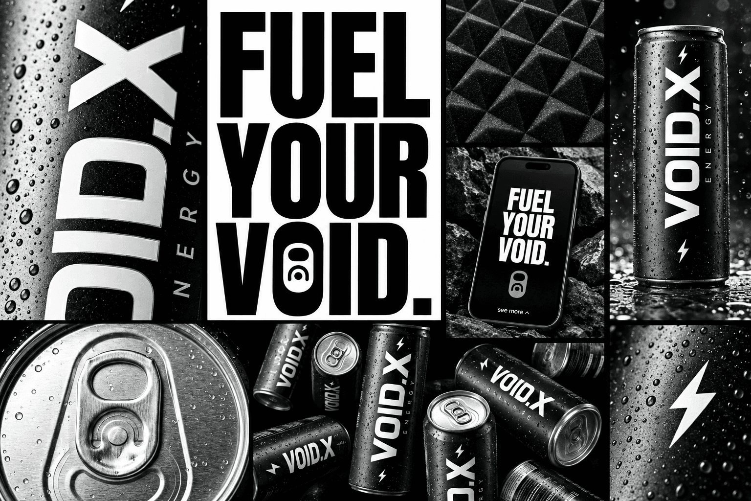
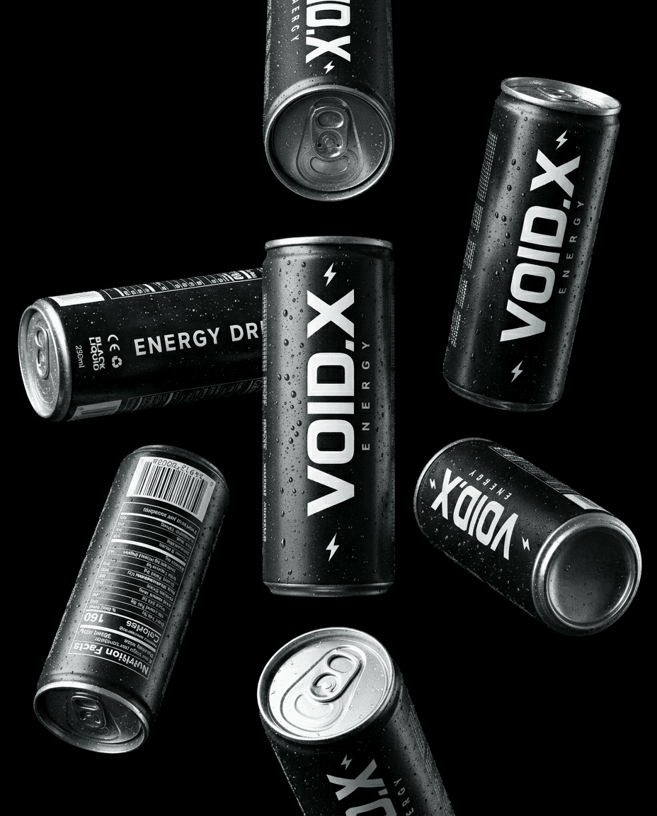
Energy packaging competes in a crowded visual category where bright color and aggressive effects often blur together. This identity study needed a recognizable presence at shelf distance while retaining enough restraint to work across product photography, editorial layouts and digital campaign surfaces.
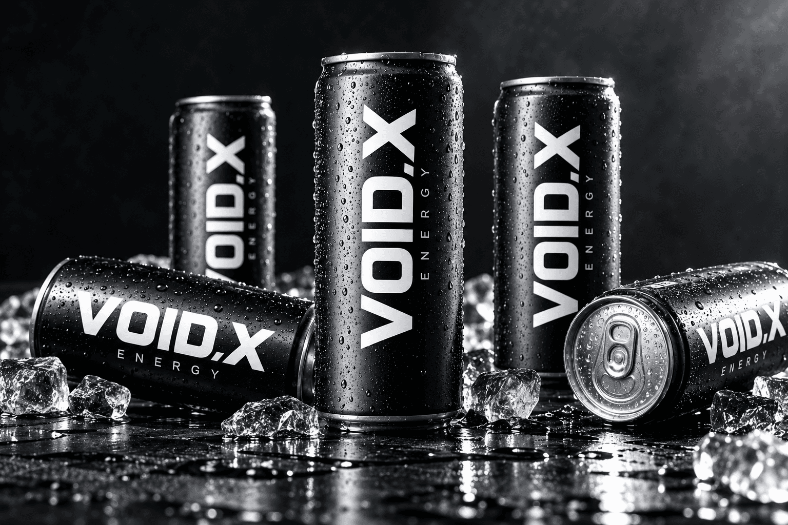
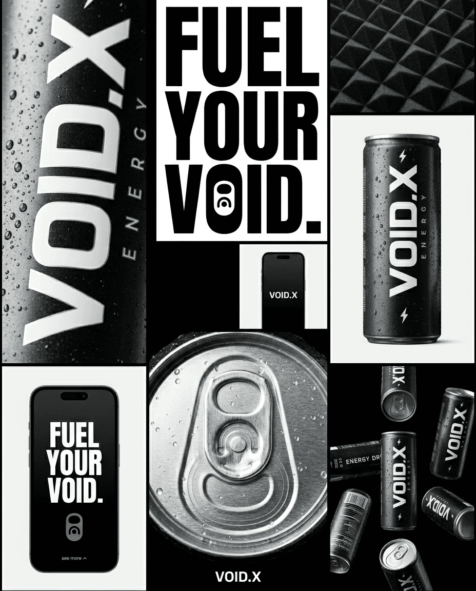
The system uses a vertical VOID.X wordmark, a controlled monochrome palette and strong contrast between matte black surfaces and reflective metal. Condensation and close crop imagery make the physical product feel immediate. The campaign board extends those decisions into a clear typographic language without adding decorative elements that compete with the can.
01 / Identity direction
Make the product the mark.
The can carries the whole identity. Its vertical wordmark creates a distinctive reading direction, and the full black surface gives the lettering room to command attention. Smaller energy cues support recognition without making the pack feel busy. Across the supplied artwork, the same arrangement remains legible when the can is upright, tilted, repeated or seen at a distance. The brand board tests that language beyond a single hero image: condensed type, product crops and negative space can become campaign assets while the package remains the central reference.
02 / Product presentation
Use light to reveal the material.
A monochrome identity depends on texture and lighting. Droplets, the can rim and the contrast between dark coating and silver metal give the packaging a tactile quality that flat graphics alone would miss. The original product composition shows multiple cans from different angles, establishing how the mark behaves around a cylindrical surface. The landscape presentation adapts that same visual language for a portfolio card; it is a design presentation rather than a claim of a manufactured launch or a commercial result.
What we delivered
Scope of work
Brand identity · Packaging design · Campaign art direction
More work to explore

SVRN womenswear brand world
An expressive fashion identity connecting a gold wordmark, urban photography and a confident campaign voice.
More work to explore ↗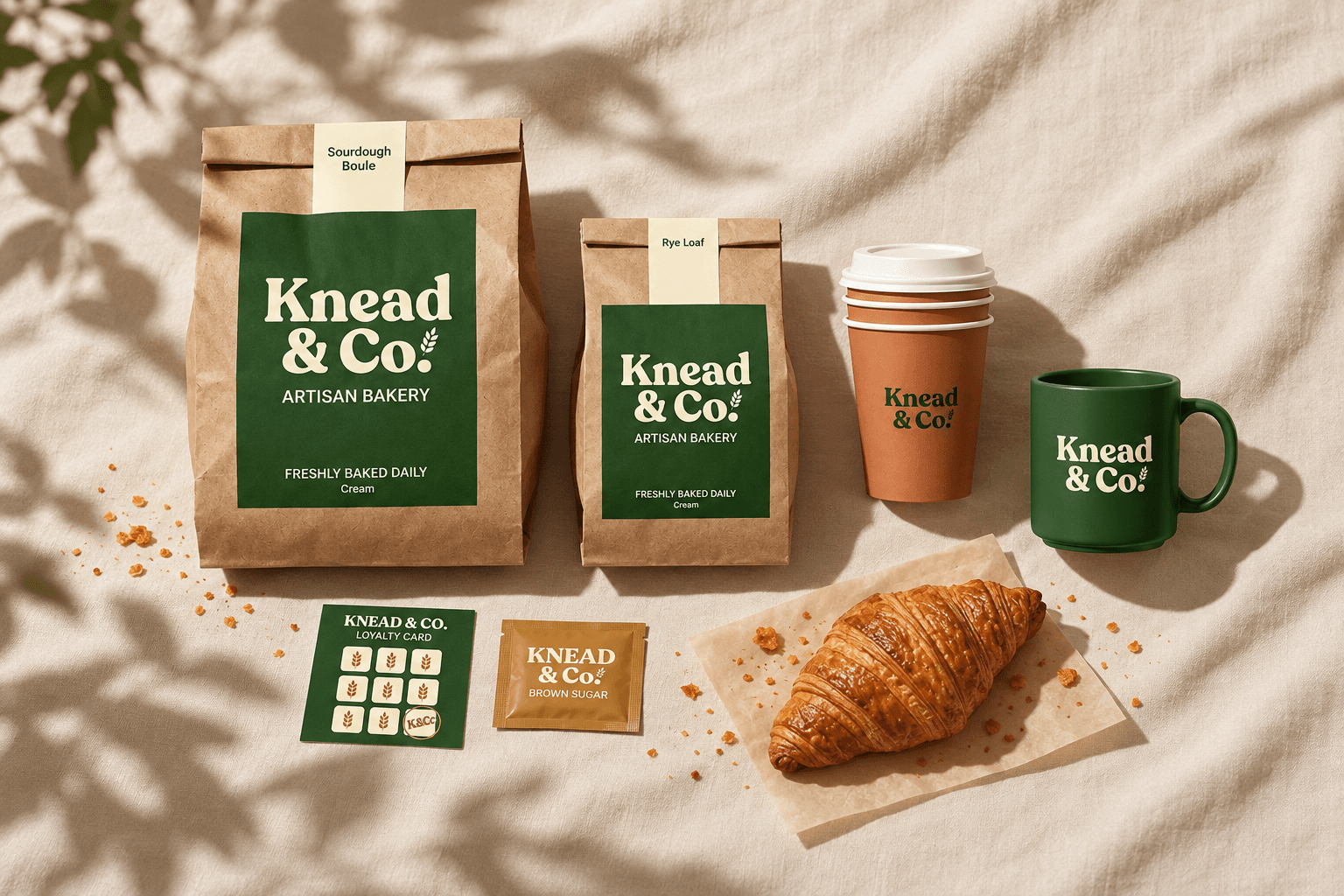
Knead & Co. artisan bakery identity
A warm visual identity exploration across packaging, takeaway coffee and customer touchpoints.
More work to explore ↗
Seren mindful living app design
A calm mobile interface study that makes daily mindfulness feel inviting and easy to navigate.
More work to explore ↗